London 2012 the brand that brought the Olympics to London
Brand Design / Brand Guidelines / Event Design / Olympic Bid Proposal
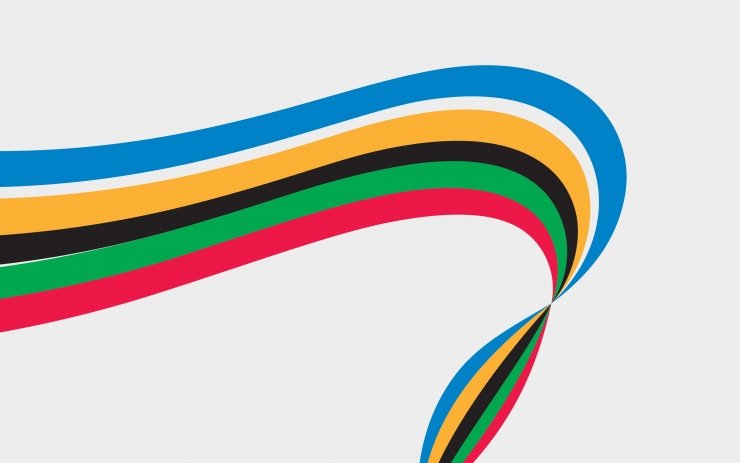
The London 2012 brand was designed to encapsulate the unity of London and the Olympic Games creating an iconic identity that resonated with audiences globally. At its core was the River Thames stylised as an Olympic ribbon flowing seamlessly through the words "London 2012." This visual not only symbolised the dynamic energy of the Games but also reflected London’s unique geography and spirit.
The brand's recognisability and its ability to connect people with the vision of the Olympics played a key role in promoting London as the host city and engaging communities in the lead-up to the Games. It successfully brought together culture, sport, and the identity of the city in a cohesive, vibrant narrative.


Results
-
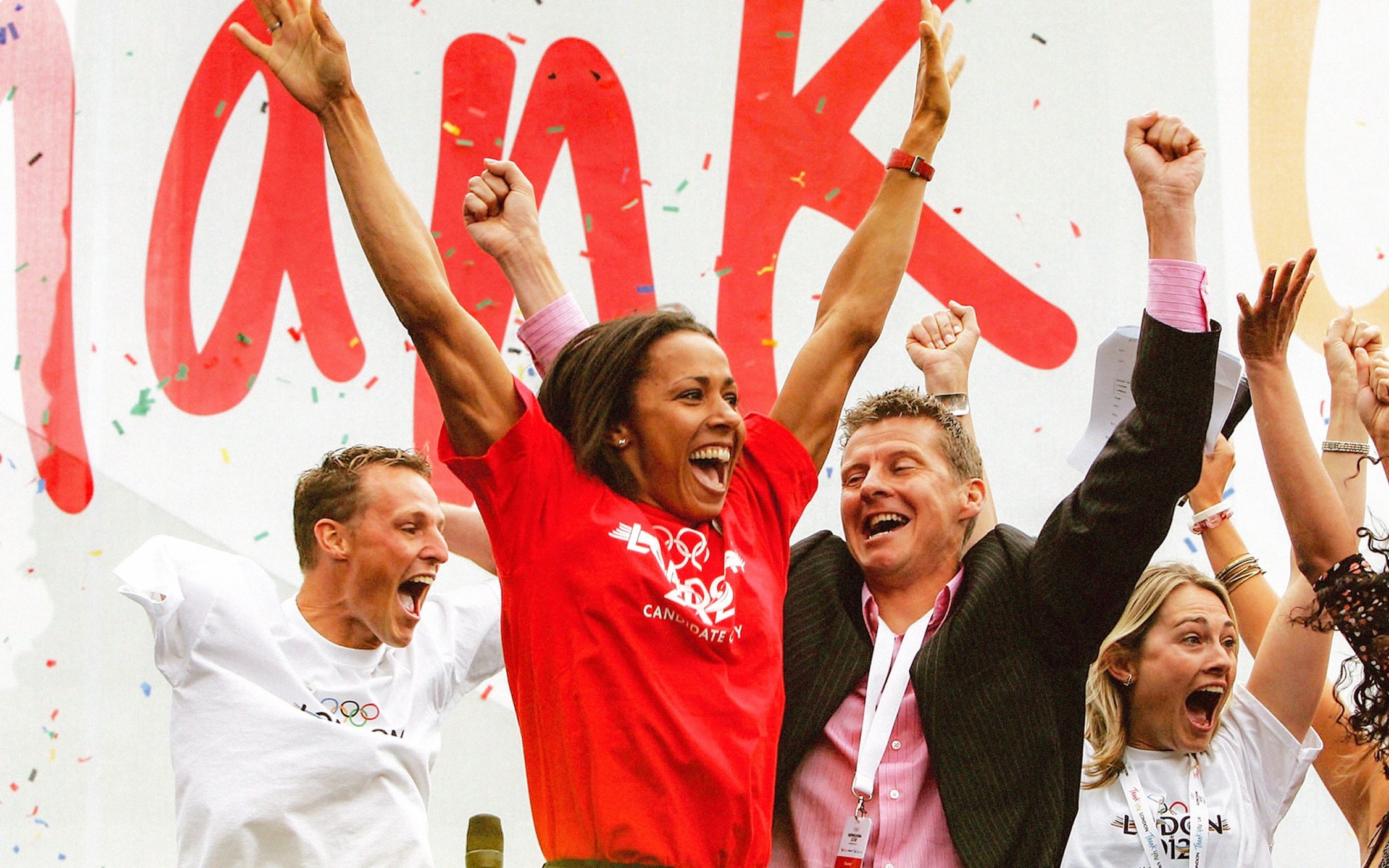
The London 2012 brand was instrumental in rallying public support and engagement, ultimately helping millions of people play an active role in backing the bid to host the Olympic and Paralympic Games. By creatively integrating the dynamic essence of London with the global identity of the Olympics, the brand fostered a sense of pride and unity.
-
The instantly recognisable design, featuring the River Thames represented as an Olympic ribbon flowing through "London 2012," became a powerful symbol of the city's ambition and vibrancy. This branding not only secured widespread public and international support but also laid the foundation for an unforgettable celebration of sport and culture.